Most business owners are too busy to spend time gathering data and monitoring performance. They need to be able to trust that their executive dashboard is accurate and up-to-date without worrying about it. That’s where automation comes in. By automating data gathering and cleansing from multiple sources, you can create an executive summary dashboard that gives you a snapshot of your business performance at a glance. This article will show you how to automate data collection from multiple sources, clean and format the data, and initiate actions from the information inside your executive dashboards.
What are companies trying to accomplish with executive dashboards?
An executive dashboard is a powerful tool that can help businesses make better, faster, and more informed decisions. By automating the process of gathering data from multiple sources, your executive team can have a real-time snapshot of their business performance at their fingertips to make data-driven decisions.
Additionally, by having all of this information in one place, it becomes easier to identify areas where improvements can be made.
There are many benefits to using an executive dashboard. Some of the most important benefits are to use real-time data to transform from a reactive to proactive decision posture, optimize resource allocation for increasing revenue and decreasing costs, and make better overall decisions.
What is the problem with most executive dashboards?
Data management is one of the most common challenges when automating an executive reporting dashboard. Dealing with data that is spread out across multiple sources and in different formats makes it difficult to get a complete picture of what’s going on. Additionally, some data may be outdated or inaccurate, which can lead to wrong decisions being made.
Another challenge is that not all data is created equal. Some data points may be more important than others, and it can be difficult to prioritize which data should be included in the dashboard.
Lack of action, based on data insights
Most executive dashboards are designed to give high-level overviews of an organization’s performance. However, they often lack the ability to show what actions need to be taken based on the data insights. This can lead to decision-makers feeling overwhelmed by the amount of data or not knowing where to start.
Data is great, but if you can’t take action based on the information in your strategic dashboard, you’ll need help. As a result, you are compelled to schedule a meeting requiring others to take action. It would be helpful to initiate processes and actions based on the information your dashboard provides you.
Too much unstructured data from too many systems
The main problem with executive dashboards is that the answers you want stem from too many different data formats in too many systems. This data comes from multiple sources, including databases, apps, and other software. If you have clean data from two different SQL servers, creating a dashboard for sales pipeline or financial performance metrics is easy. However, good data is frequently hidden in different systems of record that are kept in various databases and multiple formats. It’s never as simple as matching two financial data tables to compare the information.
To solve this problem, you need to take a different approach to creating your executive reporting dashboard from your business data. First, you need to decide what data is truly important. Second, you need to automate the process of gathering and displaying that data. This will allow you to focus on the most important aspects of your business and make better decisions.
If you can automate the process of gathering and displaying data, you will be able to focus on the most important aspects of your business and make better decisions. If you can get this far, then the next logical step is to find a way to automate processes stemming from your key performance indicators resident in the information.
Lines of business require different information
Another disadvantage of many executive operational dashboards is that different lines of business require varying views on the same data. This necessitates the creation of another dashboard or report in order to view relevant information before a step or post a step in a process.
It would be best if you had a visual representation of what steps each person in each line of business needed to take when viewing performance metrics in a dashboard. A project dashboard should show what happened in the process and what needs to happen next and who is responsible for taking that action. This way, everyone understands that the goals are to influence the company’s financial health and what steps to take to influence key performance indicators.
The key features of an automated executive dashboard are to take the data from multiple sources, use it to make decisions, and automate processes stemming from those decisions.
Companies end up with multiple dashboards and products to build them
The problem with the majority of executive dashboards is that they are built on siloed information that doesn’t provide a holistic process view. The data is incomplete. The lack of a complete picture makes it difficult for large IT teams to deliver valuable solutions from complex data.
As a result, many companies are still relying on calculations in Excel that only one person knows how to build and maintain. Excel is a great tool, and many people know how to use it, but it doesn’t update in real-time and is often out of date.
Dashboards require more than data visualization
Integrating data from multiple sources and building reports and data visualizations in a single tool like Tableau or Microsoft BI is helpful. These tools are beneficial under the right circumstances, and there are many skilled resources to help paint a pretty picture. However, many traditional businesses like yours were built before the digital age and have complicated organizational structures and business systems.
Limitations to building executive dashboards with Tableau
Tableau is a great tool for data visualization. It can help you quickly create visualizations of your data, which can then be used to make better decisions. Tableau also has the ability to connect to a variety of data sources, so you can get a complete view of your data. This makes it easy to see how your data is related and how it changes over time. Since Tableau primarily focuses on data visualization, it doesn’t work well with unstructured data. You will need to properly clean and structure your data before getting started with Tableau.
Tableau also lacks some important features to make working with the software more user-friendly. For instance, there’s no option to refresh reports. This increases manual labor in updating data on your own server from within Tableau’s interface. You’ll have to go all back through every single time something changes. The lack of version control also means if someone else edits one section or creates new charts, then yours is modified as well. It’s then difficult to change back since nobody knows what was previously published. Lastly, Tableau tables are limited to 16 columns wide. If you need to display larger tables, you will have difficulty.
Limitations to executive dashboards using Microsoft Power BI
Microsoft Power BI is a business analytics tool that enables you to connect to data from a variety of sources, including Excel files, SQL Server databases, and Azure cloud services. Once you have connected to your data, you can use the built-in tools to create reports and data visualizations.
Microsoft Power BI includes built-in functionality for creating reports and data visualizations. This means that you don’t need to purchase additional software or learn how to use separate tools in order to create visual representations of your data. It also allows you to connect to a variety of data sources. This means that you can get a complete view of your data and see how it changes over time. This makes it easy to identify trends and relationships in your data.
However, the desktop version of Power BI has an interface that’s not user-friendly and can be difficult to navigate. It doesn’t work with iOS, so you’re stuck using the clunky web app for your data processing needs–and its size limit is crazy small! Sometimes when working on larger datasets containing complex features such as geographical coordinates or text strings in columns, organizing them into reports becomes overwhelming because there isn’t enough memory available within this program. This may lead to crashes during certain operations causing loss of data.
How to Build Modern Executive Dashboards
In order to get the most out of your data, it’s important to have a strategic dashboard that is easy to use and provides the ability to take action on the information that is displayed.
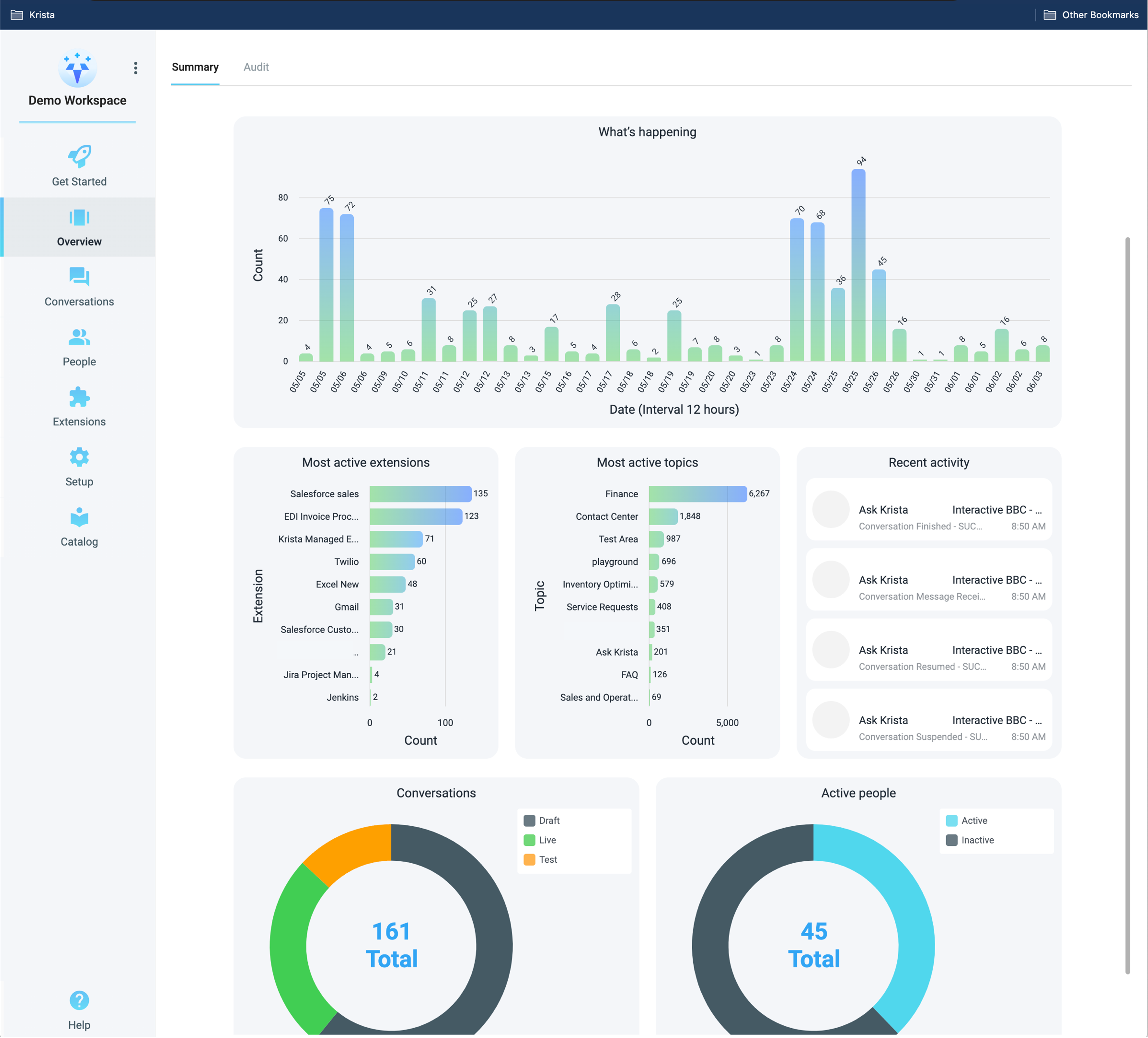
Krista Intelligent Automation provides actionable data from multiple data sources that your people can understand and initiate actions from.
Krista makes it easy to create role-based executive dashboards by integrating data from databases, spreadsheets, documents, emails, and apps. This allows you to see the most important information to you, make decisions based on that data, and initiate automated workflows.
Natural Language Understanding
After reducing data complexity with “Krista,” non-technical users can create powerful dashboards as easily as they can create the trivial ones that motivated them to invest in BI technology in the first place.
The key is Natural Language Understanding (NLU). With NLU, you can ask questions in everyday language and get answers in the form of data visualizations.
This makes it easy for anyone to create human-centric executive dashboards.
In addition, NLU provides the ability to take action on the information that is displayed in the dashboard. This makes it easy to get started with executive dashboards and make the most of your data.
Works with existing data sources
Krista provides hundreds of connections allowing you to connect to your apps or data source once and reuse that connection over and over. This increases deployment speed and limits long-term technical debt. Krista can provide a comprehensive executive dashboard quickly so you can start taking action.
With Krista, you don’t need to worry about setting up or maintaining complex data infrastructure. Krista’s powerful data connectors make it easy to connect to any data source, including on-premises databases, cloud-based applications, documents, and web services.
Customizations take minutes not months
An executive dashboard should be easy to build, modify and customize for each line of business. The tech should be easy enough for a non-technical person to edit and not force changes to wait in the backlog. Non-technical users should be able to aggregate complex data from multiple systems in a nothing like code conversational experience. They should also be able to rapidly enrich the aggregated data using AI, again with nothing like code experience. This empowers the executive to make decisions quickly and efficiently to speed up the business.
When it comes to creating an automated executive dashboard, the most critical aspect is that an action takes place from the information shared in the dashboard. This allows executives to make decisions quickly and efficiently without wading through mountains of data. By customizing the dashboard for each line of business and empowering non-technical users to aggregate and enrich data, you can create a powerful tool for automating your business outcomes.
Trigger automated actions from data-based decisions
An executive dashboard should do more than just provide high-level data analytics of what’s going on in an organization. The best dashboards also help automate decision-making by triggering actions from the data they display.
Krista automates workflows amongst your people, data, apps, and AI directly from the dashboard data to improve business outcomes. Krista ensures everyone is kept informed and coordinates processes among people.
By automating decision-making, Krista dashboards can help organizations operate more efficiently and effectively. And that’s something we can all benefit from!
Executive Dashboard Examples
IT Security
An executive dashboard for IT security might aggregate data from multiple data loss prevention (DLP) or endpoint detection and response (EDR) systems. The goal is to reduce duplication of effort in managing these various tools and prioritize and automate remediation tasks that need to be carried out.
The dashboard should give the security team an overview of all the potential threats that have been detected and what actions are being taken to mitigate them. It should also be possible to drill down into individual incidents for more details.
By automating some of the tasks associated with managing security risks, the dashboard can help free up time for the security team to focus on more strategic tasks. In this way, it can be an invaluable tool for keeping the organization safe from cyber threats.
ERP / Finance
Finance dashboards are critical for giving visibility into the overall financial health of an organization. Often, these analytical dashboards will include key metrics such as profit and loss, cash management, client revenue, etc.
In some cases, finance teams may also want to extract user interfaces from different systems in order to combine views or migrate systems as part of a digital transformation project. Krista can help with this by providing her expert knowledge on key business metrics and critical data.
Accessing a financial performance dashboard can save a considerable amount of time – and frustration – by eliminating the need to log into multiple systems across an organization to gather information.
Sales and CRM
Sales and CRM are two of the most commonly used data sources in executive data dashboards. Sales data can be pulled from a number of different sources, including your company’s customer relationship management, CRM software, salesforce.com, Sugar CRM, or even Excel spreadsheets.
Once you have your sales data in one place, you can start to create visualizations that will help you understand what’s happening with your sales numbers. For example, you might want to see a trend over time of how much revenue your company is generating or how many new customers you’re acquiring each month.
You can also use your dashboard to track key performance indicators (KPIs) for your sales team. This information allows managers to get a big picture view of the organization against critical metrics, identify opportunities for expansion, and see where improvements are needed. For example, a common KPI for sales teams is the number of deals closed each month.
If you have several CRM systems, you can also use Krista to track more data and provide a 360-degree view of the customer. Most non-digitally native companies have more than one CRM system. This stems from building new products, acquisitions, divestitures, etc. Ever call customer support and be placed on hold? Of course, you have. This is because the support representative is looking up your information in another system.
Krista can connect to several CRM systems and help your teams provide better customer service. With one dashboard, Krista can provide a holistic view of the customer to help your agents provide better and faster service. Collecting information in a central conversational user interface also makes running promotions a breeze. Your business analysts can implement promotions themselves using easy-to-configure logic to make sure you maintain long-term customer value.
Supply Chain
A supply chain dashboard is a digital tool that provides real-time visibility into the performance of your supply chain. The data displayed on a supply chain dashboard can come from multiple sources, including manufacturing, logistics, and suppliers.
A well-designed supply chain dashboard will allow you to quickly identify issues and visualize opportunities for improvement. The following are a few key metrics that should be included on a supply chain dashboard:
- Inventory levels
- On-time delivery
- Supplier performance
- Order fulfillment rates
- Production capacity utilization
Including these metrics on your dashboard will give you a comprehensive overview of your supply chain performance. You can use the dashboard to identify areas of improvement and take action to improve your supply chain.
Most companies unbelievably use Microsoft Excel for supply chain planning. It’s easy. It’s flexible. It has advanced filtering capabilities.
But, It’s disconnected.
If you are looking to improve your supply chain, a real-time dashboard can be a valuable tool. By including key metrics on your dashboard, you can quickly identify issues and visualize opportunities for improvement. Implementing a supply chain dashboard will help you take action to improve your supply chain and achieve your business goals.
Krista can provide an actionable supply chain executive dashboard by connecting all your relevant data sources (even Microsoft Excel) to optimize your business. Too little inventory? Raise prices. Too much inventory? Run a promotion and offload excess inventory to your most valuable customers.
Whatever your situation is, you can automate and optimize business outcomes using Krista’s unique conversational automation capabilities to take advantage of hundreds of scenarios.
Human Resources
The HR department is usually responsible for a lot of the behind-the-scenes work in a company. From payroll and benefits to keeping track of employee records, there’s a lot that goes into making sure everything runs smoothly.
An HR dashboard can help streamline some of these processes by giving managers and executives a quick overview of everything that’s going on.
Some things that an HR dashboard might track are:
- How many employees have been onboarded/offboarded in a given period
- What the average length of employment is
- How many vacation days have been taken
- What the turnover rate is
- What the absenteeism rate is
Having all this information in one place can help managers make informed decisions about staffing levels and employee retention. Given factors like the recent pandemic, supply chain disruptions, rising interest rates, and sales pressures, optimizing your human capital needs is crucial to your company’s success and financial health.
Krista can help with human resources by automating processes like onboarding and tracking employee records. By connecting to various data sources, Krista can provide a comprehensive overview of everything that’s going on in the HR department. This information can help managers make informed decisions about staffing levels and employee retention. With Krista, you can optimize your human capital needs and ensure that your company is running smoothly.
Conclusion
Digital executive dashboards are essential for any business looking to make data-driven decisions. By providing a holistic view of the customer, supply chain, or HR department, executives can quickly identify issues and take action to improve performance. Krista is the perfect tool for businesses that want to build actionable executive dashboards. With Krista’s help, you can collect information from multiple CRM systems in one place and easily run promotions using easy-to-configure logic. Implementing a digital dashboard will help you take control of your business and achieve your goals.


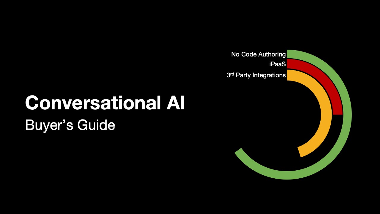
2023 Conversational AI Buyer’s Guide
Discover which platforms provide the best citizen developer, integration, and AI support.